Like many of you I am completely baffled every time Congress members threaten to let our federal government shutdown. And by the way, there have been 21 shutdowns since 1976. And worse, some in Congress right now appear to have no real motivation to collaborate in order to avoid it. Why? Because their Cult leader is commanding them to stonewall not just the House Speaker, but also millions and millions of Americans who desperately depend on Social Security, Medicare, SNAP, and other federal benefits to survive and get by month-to-month! They will be left out in the cold with none of these retirement needs coming in. And I won’t even go into how our military, law-enforcement, federal courts, transportation hubs, NASA and NOAA, disaster responses, nationwide education, and a whole host of other programs and agencies too long to list here.
(AP Photo/Mariam Zuhaib, File)
How is this possible? The United States is the ninth wealthiest nation in the world in adjusted GDP/capita (2022). The U.S. has the second most billionaires in the world behind first-place China (2023). And furthermore, the United States has the strongest economy in the world over China, Japan, Germany, and India, respectively (2023).
So how is it possible that our federal government does this too frequently and has actually shutdown 21-times and possibly a 22nd time this coming October 1st? How!? Is it because not enough of America’s wealthiest people and corporations pay their fair share of taxes? Why has this “shutdown rattling” (of swords) become chronic in America? For more details:
Addendum 10/3/2023 — My friend Steve Ruis over at Uncommon Sense published a very good post on our government shutdown:A Distinctly American Problem? Really?I recommend checking it out. It’s well worth it.
“My definition of a free society is a society where it is safe to be unpopular.” — Adlai Stevenson
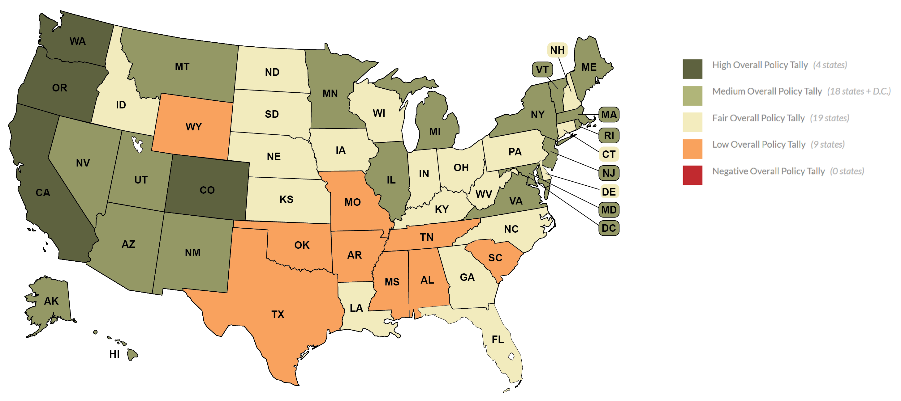
As of August 7, 2023, the Movement Advancement Project (MAP) released its annual scorecard for each of the U.S. state’s democracy rating. As I alluded to in my previous blog-post and its comments, my home state of Texas has been passing legislation over the last two–three years which suppress the votes of non-white, anti-conservative, less-advantaged Texans or making easy convenient access to voting stations, and actual voting, increasingly difficult. Over the last 5-7 years it has been ever harder for myself to vote and/or register to vote, and I am a well-educated white man! Now riddle me that one please!
Nevertheless, I was quite interested in knowing what Texas’ scorecard reveals. Not much of a surprise to me our democracy tally has been rated “Low” (in the orange) scoring 6.5 out of 33.5 points. Personally, that’s a fair score given how noticeably more difficult it has become for me—a college educated white man—to vote or re-register to vote after my frequent moves between Dallas and Kerrville, TX for Mom’s declining dementia, and to get this year (as well as 4-yrs ago) a new renewed driver’s license. By the way, have I told you that I am an 8th-generation white Texan with no criminal record or outstanding warrants, fines, over 42-years of employment and paying my share of taxes over those 42-years? Eighth-generation means my family was here in Texas BEFORE it was annexed by the United States in 1845!
As far as MAP’s “Who Votes” and “How to Vote,” two of the three main metrics for scoring, yet again, no surprise whatsoever for Texas’ abysmal ratings: Who Votes — a -0.5/5 and How to Vote — a -0.75/5. Our highest ratings? “Election Security” 4 out of 6, and “Voting in Person” 2.5 out of 5.5. Both of those better scores, yet still weak, I have explained their difficulty mediocrity in detail over the last decade. “Election Security” is cryptic Conservative code for Much Harder to Vote and “Voting in Person” means Hard Registering to Vote, respectively.
Curious to know what four states rate the highest in democracy’s election laws and policies according to MAP? Yes, you read that correctly, only 4 states out of 50, or just 17% of our population of 332-million Americans reside in a state with high-levels of democracy. Let me repeat, just seventeen percent of Americans! Here are those highly democratic republic states:
Washingtonwith31out of 33.5
Coloradowith 30out of 33.5
Californiawith 29.5out of 33.5
Oregonwith 26out of 33.5
Let’s see who the last four states of the Union are with the most undemocratic elections and policies:
47. Tennesseewith 5.5out of 33.5 48. Arkansaswith 5.5out of 33.5 49. Mississippiwith 4.0out of 33.5 50. Alabamawith 3.25out of 33.5
What percentage of the American population do these four states make up? The answer: almost 6%of the American population.
The bottom-line is and what these numbers show when one reviews the entire fifty states on the MAP’s website is that a large portion of the American 50-states and their populations are NOT truly, purely democratic in their elections and policies. I don’t know about you, but I find these facts disturbing, alarming, and they need to be confronted and addressed not just by each individual (legal) American citizen, but also by your district’s House of Representatives and your district’s Senators! Are we not a Constitutional Republic democracy as written in our Charters of Freedom by all six (6) of the Core Founding Fathers? Yes, of course. Then WHY do twenty-nine (29) of our fifty states score a measly grand tally of just 16.75 (or lower) out of 33.5 democracy data-points? Those scores are abysmal!
What has happened to democracy in the United States to rate that horribly on the major points of what defines a TRUE democracy?
Try to Live Free – Love Much – Laugh Often – Learn Alot More
Since at least 1994 I’ve always been intrigued to know how my home state (Texas) ranks in Quality of Living tables compared to the other 50 U.S. states. Why? Very simple: affluent Texans, many of which are only first, second, third, or perhaps fourth generation Texans, arrogantly boast that Texas (at least politically) is hands-down THE best state in the Union. Yes, I hear this from fellow Texans quite often, mostly in the rural areas. I have heard these claims most all of my six decades of life while living here. It seems to be a personal source of deep-seeded pride whether justified or not.
But I have always been greatly puzzled by their expressed, audacious claim. Aside from one’s own biased personal opinion, by what metrics, by what standards could these whiteTexans possibly be referencing? I regularly check these quality of life criteria, every 1-2 years minimum, not just for the required oversight and civic duty/privilege by a concerned, caring citizen, but also to monitor how our Lone Star State is progressing: Is it thriving, stagnate, or declining?
According to US News & World Report, the data points collected in ranking the U.S. states overall are many. The two primary categories most all Americans most care about are healthcare and education for its residents. Secondary points are public safety, social and occupational opportunities, economy, roads, bridges, environment, internet access and other infrastructure.
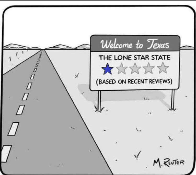
Well, sorry (again) Texas, the 2023 facts and data are not good at all for Texans and their “proud friendly” state. The overall quality of life in Texas is below average: ranked35thout of 50 states. In fact, Texas doesn’t rank #1 in any of the eight primary categories, much less the lower priority categories. In 2021 Texas ranked 31st overall, today down four places after two years. It ranked 36th in 2018 and 38th in 2017. There is however, one particular category Texas has always excelled in: its economy. There has always existed in Texas-economics very plush advantages for past and present wealth-accumulators to make much more excessive wealth; tax-codes and opportunities abound for Texas’ upper-class. This is exactly why Elon Musk, originally of South Africa, the founder/CEO of SpaceX, Tesla, present owner of Twitter, and a number of other mega-businesses, moved here and now calls Texas his home. He is just one of many of America’s wealthiest persons living in Texas.
Ironically, the one category Texas has never excelled in since these stats and data-points were first collected is its Individual Median Income—it is $38,059 for 2023 single-earner Texans. Sadly, according to SmartAsset’s study, individual Texans need to earn a minimum $44,865 per year and closer to $133,926 to be considered “middle-class,” or to only have a decent standard of living while working and alive, barring any unforeseen emergencies or catastrophes.
from “You Might Be From Texas If…” by author and cartoonist Nick Anderson
from “You Might Be From Texas If…” by author and cartoonist Nick Anderson
from “You Might Be From Texas If…” by author and cartoonist Nick Anderson
from “You Might Be From Texas If…” by author and cartoonist Nick Anderson
It becomes quite obvious why there is such a large disparity in the Lone Star States’ Quality of Life categories, like the economy versus all other categories. What is it? What drives this lopsided metric? It’s income and economic inequality. Severe? Probably. Improved? Not at all. Digressing, expanding? Most definitely.
So one must ask these (typically rural and far-suburban) Texans, What verifiable facts and data are you quoting to conclude that Texas is THE best state in the Union to live? My next two questions to them are 1) What zip code do you live, and 2) Where exactly have you and your family been experiencing Texas the last at least 30–40 years?
Care to guess what bewildering answers I usually get?
∼ ∼ ∼ § ∼ ∼ ∼
Addendum Aug. 22, 2023 — In conjunction with this post I am connecting or linking my next blog-post to this one as a follow-up. It is entitled “Rating Democracy in All 50 U.S. States.”
Try to Live Well – Love Much – Laugh Often – Learn Alot More
As we near our 2024 U.S. federal-state elections and their ramping up political campaigns of patent rhetoric, of misdirected, or even audacious lies and disinformation, one primary target radical MAGA Republicans are obsessed with and annoyingly screaming about is …inflation. Inflation that technically began on February 24, 2022. They place all blame for this current hyper-inflation on President Biden and his political party. This is no surprise, of course, considering the next reasonable target they might have, and I use “reasonable” very loosely here, would be Hunter Biden’s laptop. HAH!
But let’s use our better, mature judgement and our critical-thinking and analysis skills we learned from middle- to high-school to perhaps under-grad to determine the true source of this inflation.
The above diagram basically illustrates the distribution chain of goods and services from crude or basic materials from Earth, to production, refining, or manufacturing, to transportation, to more distribution or delivery-transportation, to retailers, then finally to consumers or us average Americans. Study the diagram closely. What processes or stages make up the bulk of the distribution chain?
Take a moment to consider carefully.
Do you think you have it? It isn’t obvious with a Nano-second first glance like most super busy Americans do when listening to or reading about political campaigns or propaganda packed with deception, disinformation, diversion, or blatant lies. What is it that makes up the bulk of the world-wide distribution chain?
Movement.
It is the movement of these raw materials to production, refining, or manufacturing facilities, then movement to transportation hubs like sea ports, cargo trains and planes, or truck loading bays, then typically to large warehouses everywhere for (temporary) storage before those goods/materials are again loaded onto regional or local transportation-delivery vehicles or vessels to be unloaded at retail stores for us buying consumers. Now, how is all of this “movement” of materials and goods accomplished? What drives all this distribution forward from start to finish or from supply to demand?
Energy.
What type of energy for 21st-century transportation, typically?
You guessed it… fuel, gasoline, petrol.
Where does most of the world’s “energy” come from?
Ding, ding, ding! 🛎 Yep, you guessed it, crude oil. And what nations produce the most crude oil, oil-refining, and distribution or export of fuel, natural gas, and petroleum byproducts? Let’s take a look.
Investing News Network (INN) provides independent, trusted news and education for financial investors in over 40 targeted categories, including oil and petroleum production and export. According to their March 2023 update, the Top 10 Oil Producing Countries are as follows:
To further clarify the Brazilian question above in the table, the ❓ means: how will the newly elected President of Brazil align himself and how their government aligns itself with the U.S. and Western alliances against Russia’s war in Ukraine, will all determine their production, export, and prices of their 3,689,000 bpd for the West. It doesn’t require a lot of deduction and analytics from the above diagram to determine that the majority of energy production/export, which heavily influences the distribution chain of transported goods/fuel around the world, is squarely in the hands of Russian allies or closely tied nations to Russia, specifically Vladimir Putin and his Kremlin regime. Do the math for yourself from the above BPD numbers. Five of the top ten oil/fuel production countries are allied with Putin/Russia. Seven of the top ten are in increased close relations with Putin/Russia. These foreign economic and energy facts do not bode well for decreasing or relaxed (hyper?) inflation for Americans in 2022, much less for 2023.
But one undeniable fact remains true and steadfast. Our current inflation rate has NOTHING to do with President Biden or his political party and agenda. Period! Current and persistent (hyper?) inflation has everything to do with Vladimir Putin, Russia warring in Ukraine, Saudi Arabia, China, the UAE, and Iran. And it is no stretch to include Iraq—after how we shit on them during two deadly, destructive wars, the second war an illegal invasion and occupation—Kuwait who has become more friendly to Russia, and perhaps Brazil. These are the REAL factors behind our insane inflation rates, in addition to mega wealthy corporations just passing on (the buck) high-prices to average middle-class and poor-class Americans who cannot weather a full 2-3 years of hyper-inflation.
But one undeniable fact remains true and steadfast. Our current inflation rate has NOTHING to do with President Biden or his political party and agenda. Period!
Do not believe any of the increased political propaganda, disinformation, diversions, or blatant lies from radical MAGA Republicans screaming about who is responsible for this debilitating inflation we are in. It simply is not true, nor can it be justified. It’s simply wrong.
The numbers and facts above show clearly who is to blame. And on a side note and endnote, consider too the OPEC nations, who further drive the price of distribution chain fuel costs, effecting everything in the global economies and especially in the U.S. Besides, why would Joe Biden intentionally drive us into these hard, expensive times? There is no political gain for him to do so. No, get real and reasonable voting Americans. These hard times since February 24, 2022 have very, very little to do with the White House or one political party. They have everything to do with one man in Moscow and his oil producing allies.
I want to change tacks (a sailing term by the way) diverging from my recent COVID-19 posts, and share some other news I found peculiar and enlightening yesterday, Friday, May 15. My readers who are sports fans, particularly football/futebol fans (Ark, John Z), should find this interesting, I hope.
∼ ∼ ∼ § ∼ ∼ ∼
Some of you know that I am an avid football/soccer fan. I played The World’s Most Beautiful Game all my life, had a very successful collegiate career, and a rather short, average pro career then semi-pro career. All that to say, that along with the Canarinha, or Little Canaries of Brazil, I enjoy keeping up with our U.S. Men’s and Women’s National Soccer Teams, their schedule, who is coming up through the ranks as Wonder Kids and how our Youth Development is progressing compared to the Juggernauts of world football’s Pantheon. So off we go!
From our Declaration of Independence, 1776:
We hold these truths to be self-evident, that all men are created equal, that they are endowed by their Creator with certain unalienable Rights, that among these are Life, Liberty and the pursuit of Happiness.
“That all men are created equal.” What does that mean exactly? How does it translate to 21st century America? Does it mean equality for all Americans? Does it mean a nation without prejudice, without discrimination and racism, and tolerance for same-sex marriage? If your honest about all of American history, in all aspects of American life, then the answer is no. Some Americans are not equal and do not have equal opportunity as others.
And even 244-years later Americans are still confused and fighting each other as to how those famous opening words translate. So in our Declaration of Independence, later spelled out in much more detail in the Bill of Rights, the Constitution and all her Articles and Amendments it was further defined and explicitly and implicitly explained, protected, and enforced by our Three Branches of Government. And yet many of us are still confused, sometimes fighting each other, and still practicing and supporting modern forms of discrimination, prejudice, and inequality in too many areas of American life. Case and point, from the U.S. Soccer Federation website May 15, 2020…
JOINT STATEMENT FROM THE U.S. SOCCER FEDERATION AND THE U.S. SOCCER FOUNDATION
Today the U.S. Soccer Federation and the U.S. Soccer Foundation released the following joint statement:
We have come to an agreement that we believe is in the best interest for the sport in the United States. As we move forward, the U.S. Soccer Federation and the U.S. Soccer Foundation will work together to provide access and opportunities for all soccer players across the country, particularly those in low-income communities and others in need.
Celebration of the U.S. Women’s National Team World Cup win.
That is all they said. Just 74-words long short.
Though the statement isn’t specifically spelled out in detail, barely at all, I believe what the USSF and the USSother-F are indirectly stating has to do with our now decades old Youth Academies and Development Programs across the nation. I find that highly intriguing and worth a bit of discussion should anyone be interested! Yes?
One reason why I find this highly intriguing for the men’s team is that since the late 1990’s and the FIFA 2002 World Cup in S. Korea & Japan—when our USMNT did phenomenally well with many highly accomplished players playing their club ball in Europe at good-to-great, elite, world class clubs with and against the world’s other elite, world-class players and coaches—the USMNT performances since 2002 have been a roller-coaster and shockingly unpredictable qualifying for the World Cups every four years and worse still, out of one of the easiest Confederations to WC-Qualify from: CONCACAF.
Why is it easy, or should be so easy, for the men’s U.S. National Team to qualify for the World Cup every four years? Mexico does it pretty much every single time. Costa Rica and maybe Panama or Honduras qualify every so often. Three nations qualify out of a total of maybe FOUR traditionally power-house nations; three is perhaps more accurate. Yet, with all the financial clout, resources, and sporting athletes the United States possesses now and has possessed since 1994—when the World Cup was here last and President Reagan promised FIFA and CONCACAF we would have a premier football league by 1996 or 1998. From a 1988 New York Times article:
U.S. Awarded ’94 World Cup Tourney in Soccer
Fricker said the U.S.S.F. will begin developing plans for a national soccer league, one that will encompass in some way teams from existing semiprofessional indoor and outdoor leagues. The league, he said, would operate at three levels, based on ability, to create ”the ideal environment for America to develop highly skilled players.” Presumably, as the 1994 tournament approaches, the best players will win positions on the American team. — by Michael Janofsky, NY Times, accessed 5/15/2020
Unfortunately, none of this has really happened. Not for the boys and men. Why not? One of the USMNT’s most tragic performances since Reagan’s promise to FIFA and Americans in 1988 was not qualifying for the 2018 World Cup in Russia. We were beaten by Trinidad-Tobago and thus eliminated, and after a very good showing four years earlier in Brazil (see below ESPN video).
Yes, I do believe! I believed in our USMNT not only during the run-up to the 2002 World Cup in Korea/Japan, but for our national men’s teams from 1994-1998 because we had several talented boys playing for clubs in Europe and South America! Some of them came through the mediocre NCAA-D1 programs, yes. But many of them did not waist those four irreplaceable years, went to play with outstanding foreigners in other divisions and leagues, then went abroad to improve. That is, improve European or South American style. Yes indeed, we had the talent then, we still have it now! What has been going wrong?
Another case and point. Ever since the incredible tournament play in the Group Stage then Round of 16, continuing into the Quarter-finals of the 2002 World Cup, our absolute pinnacle to-date for soccer history and our boys, and we are still struggling! Something has not been jiving in U.S. men’s national team football, in our professional leagues like the defunct NASL, the old MLPS, the USFL, and now MLS as well as in the Youth Development programs the last 26-years or more? Twenty-six years is a time-span of at least one or two American generations! Do we now have a blurred answer, a sort of iffy cloudy answer now?
What are the USSF and the USSother-F saying, but not saying?
I would love to see your thoughts about this Joint Statement, its implied cause(s), and the implications and possible outcomes.
I have zero expectation that anything I ever say will end someone’s belief in their God. Not my goal or purpose. That alone belongs to the individual. ~ Zoe
'Light thinks it travels faster than anything but it is wrong. No matter how fast light travels, it finds the darkness has always got there first, and is waiting for it' - Terry Pratchett